Lead Generation Landing Pages
Are you using landing pages for lead generation? These 9 examples will show you best practices to get the most from your lead generation efforts.
If conversion rates are low, despite lots of traffic, chances are, you can blame your landing page for the disconnect.
Lead generation is equal parts art and science, and a critical ingredient in helping you collect leads so that you can convert them to prospects, then customers.
Studies have shown that marketers capture more leads by sending them to dedicated landing pages than directing them to the home page (big mistake, BTW). Beyond the initial capture, lead generation landing pages can help you track prospect data and learn more about your prospect demographics.
With these little tidbits in mind, it’s safe to say that the lead generation landing page plays a huge role in your sales process.
Keep reading to learn more about what works, what doesn’t, and see some examples from real brands.
What are lead generation landing pages?
Landing pages are webpages that users “land” on after clicking on an ad or social media post.
Instead of hoping your visitors chance upon your CTA somewhere deep in your website, a lead generation landing page takes them to a page that invites them to subscribe, buy, or sign up.
What’s important to understand about lead generation landing pages is, there’s a major difference between a purchase or checkout page and one that’s built to collect prospect information.
A lead gen landing page represents the very beginning of the conversion funnel—where customers enter their information in exchange for a resource. This information typically includes things like their name, email, industry, phone number, or company size.
While the information you collect varies by industry and objective, what you collect is used first to figure out whether that lead is qualified, and then used to nurture that prospect closer to closing a sale.
Why do you need to use lead generation landing pages?
A landing page (done right) provides more context for the product/service featured in your ad—and focuses exclusively on one specific offer. The best examples use eye-catching imagery, action-oriented copy, and point to a clear next step.
Who uses lead gen landing pages?
Well, any company that uses email marketing to nurture leads can benefit from using lead gen landing pages, though companies with longer sales cycles may benefit more than those offering low-consideration products. Think enterprise-level SaaS tools or managed IT services versus an e-commerce shop that sells inexpensive beauty products.
1. Mixpanel
What’s Working – Mixpanel’s header image is actually a GIF that gives users a look inside the tool right off the bat. We’ve all visited websites for SaaS platforms that fail to provide any screenshots or examples of what the product looks like, and the experience can be pretty frustrating.
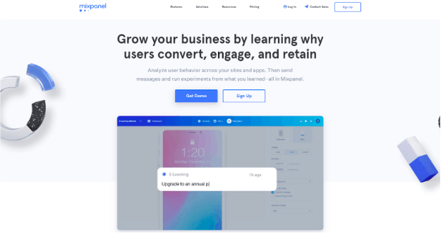
When visitors land on a lead generation landing page, they need to see what they’ll get when they sign up. Mixpanel’s headline highlights the key benefit–understanding your users, adds more detail in the subject line, then reinforces the value prop by showing, rather than forcing you to read more copy.
What Could Be Better? – We probably wouldn’t change much about this page. Mixpanel has done a great job creating an engaging landing page experience that gives users plenty of information without forcing them to share much data or read several paragraphs of text.
2. Fireeye
What’s Working – FireEye leads with a strong headline that sells the white paper really well. If someone lands on this page, they’ll immediately see that the download will offer some information about protecting their data, brand, and intellectual property from cyber attacks.
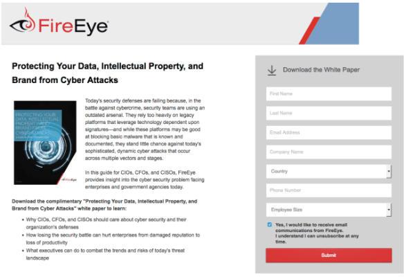
What’s more, the cybersecurity brand lets users know who this guide was written for–CFOs, CIOs, and CISOs–so readers know they’re getting insights that speak to executives who know a great deal about the subject matter, not someone new to the topic.
What Could Be Better – Cybersecurity, is of course, very serious business. And, as mentioned, this landing page lets visitors know that this content was developed with a high-level professional audience in mind. Still, the opening paragraph seems a bit long for a landing page–we’d recommend limiting this to three lines–max, then diving into the bullet points.
The lead capture box could benefit from a larger CTA button with more actionable text. The small, “submit” doesn’t do much to convince someone that might be on the fence.
3. Marketo
What’s Working – We liked that Marketo used the minimal copy in this landing page, instead of diving right into what they want you to do. The lead capture form is relatively short, while still providing enough context for personalized nurturing down the line.
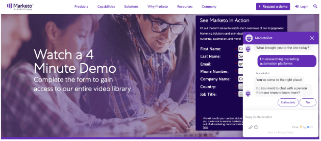
What’s also nice about this example is the headline “Watch a 4-Minute Demo” and the subheadline “Complete the form to gain access to our entire video library” lets users know exactly what they’re going to get.
And finally, they’ve added a chatbot to the page. This way, Marketo can ask more questions that help qualify the lead, without overwhelming users with too many form fields.
What Could Be Better? – The copy, while informative, it could be a bit more exciting and highlight the benefits you’ll get when you use this tool.
4. Trulia
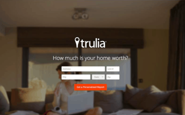
What’s Working? – The headline gets straight to the point–how much is your home worth? This simple question speaks directly to the target persona–someone who wants to sell their home and is just kicking off the research process. Even better, the person landing on this page is forced to make a decision. Do they want to learn more about selling their home or do it another time?
The page is super-focused, with no information on the page there to distract from the CTA.
Additionally, the image does a good job reinforcing the convenience factor. You have a woman on her couch, which implies that she doesn’t need to print off a bunch of papers to start her journey.
What Could Be Better? – Honestly, this is a pretty solid lead generation landing page. But, there’s no privacy policy included on the page, and chances are, the visitor will be redirected to another page asking for their email information.
While these short, direct lead capture pages are effective, customers aren’t always thrilled with the idea of submitting their info unless they know what to expect in return.
5. Campaign Monitor
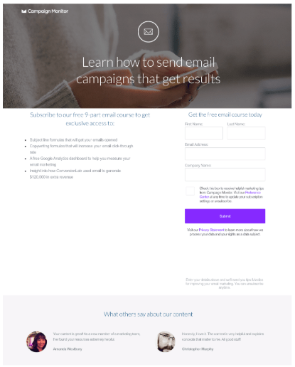
What’s Working – Campaign Monitor’s lead generation form does a nice job letting users know what they can expect out of this email course. From this short and sweet description, users can quickly scan for what they’re looking for–the course covers headline and copy writing tips, as well as a case study and a Google Analytics template they can use for their own reporting process.
They’ve also included a couple of testimonials from past subscribers, a privacy policy, and a brief explanation about what Campaign Monitor will do with your data after you hit the submit button. These elements go along way in fostering a sense of trust–which of course is the first step toward nurturing users down the funnel.
What Could Be Better? – In all, the copy and trust signals are really well-done, here. However, it’s worth pointing out that the design could be more visually compelling. It would be nice to see larger customer photos, and perhaps a couple more entries, as two recommendations seems like an odd number.
Additionally, it feels like there’s more white space than necessary. While that’s certainly preferable to an overcrowded page, the text could be slightly larger to give the page a better sense of balance.
6. Netsuite
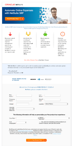
What’s Working – Up top, you’ve got a straightforward headline and a standout CTA button. Just below, visitors can see the key benefits they’ll get from using NetSuite, and if they think that sounds like it could be what they’re looking for, they can sign up for the product tour.
We also like that the lead capture form lets users know how the required job-related information will be used to bring value to the user. Lead generation forms are a tricky thing. On the one hand, those with fewer form fields capture more leads than those that ask for more information. However, longer lead capture forms capture fewer, but more qualified leads.
And, as NetSuite notes, a few added details helps brands put together a quote or product tour that’s more relevant for a particular type of user.
What Could Be Better – So, while we like the simple explanation of the core features and benefits, the lead capture is placed too far down the page.
Additionally, the headline could use some work. While it’s straightforward, it doesn’t do much to inspire the user or give them a sense of how NetSuite can improve their lives.
The subheadline is a bit wordy and just rehashes the points made right beneath the copy without enticing the reader.
7. FALCON.IO
What’s Working? – Overall, Falcon.io does a nice job giving users a rundown of the features, benefits, and the look of the platform. The headline, Social Media Management Made Simple, cuts right to the chase and lets visitors know what to expect. While this is a longer landing page, users interested in learning more about what this tool actually does can gather a lot of information by scrolling.
While short landing pages are often recommended, Falcon.io does a great job providing users with an “out” by placing “request demo” buttons throughout the page.
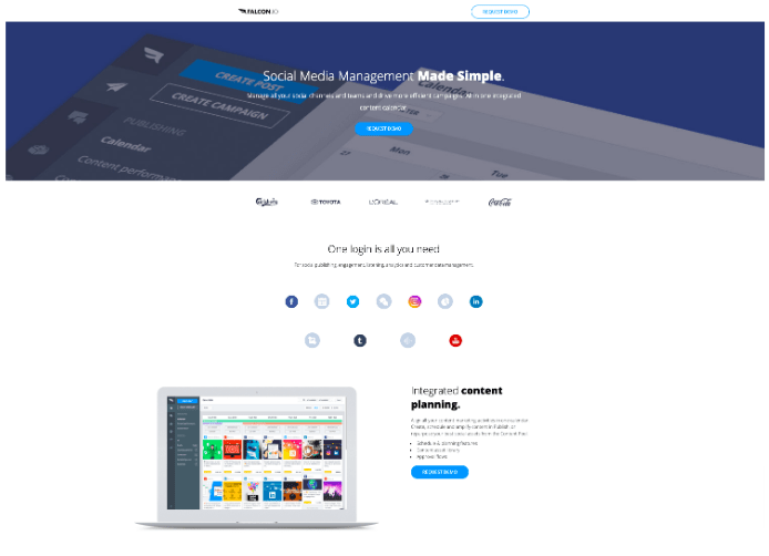
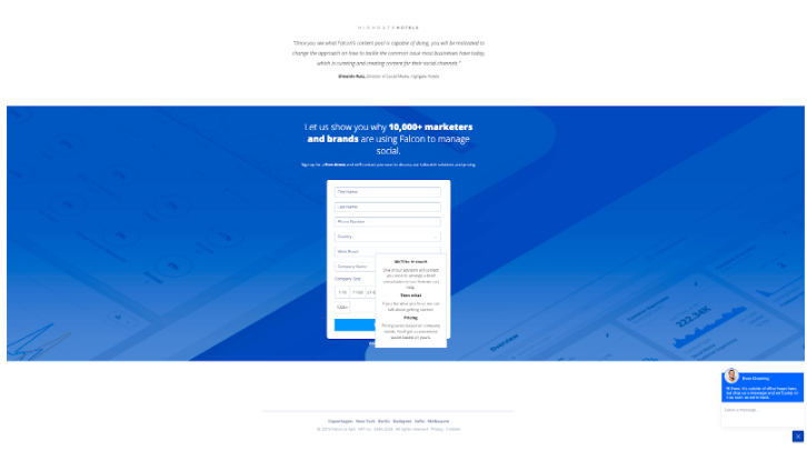
At the bottom of the page, you’ll get the full form, which contains just enough information to tailor the initial pitch, yet isn’t so long that users will get frustrated and leave. They’ve also included a roll-over pop-up, which explains what happens after you submit your information, as well as the option to chat with a live rep if you have any questions.
What Could Be Better? – This is a small criticism, but we kind of wish that Falcon moved the “One Login is All You Need” section further down the page. While it’s clearly one of the platform’s key selling points, its the least visually compelling aspect compared to the other features highlighted on the landing page.
8. Trello
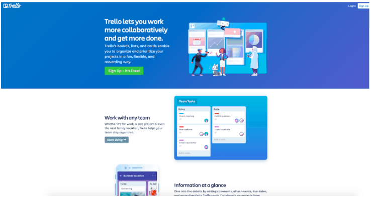
What’s Working? – Trello’s landing page is designed in a way that packs a major punch, while still keeping things relatively simple. They’ve used a green color for the primary action item (sign up – its free). All elements work together to create a compelling CTA that feels more like a friendly invitation than the high-pressure “register now” buttons we see all the time. It also shows visitors that there’s nothing to lose by signing up–it’s free, why not give it a chance?
We like the eye-catching graphics, blue and white color scheme and how they’ve chosen to highlight different features by alternating copy and graphics in a way that grounds these elements without making it feel crowded.
What Could Be Better? – Given that Trello operates on a freemium model, there’s no real way for them to learn about your brand until you decide that you might want to sign-up for a paid plan. Clearly, this works for Trello, as signing up for an account means they’ll have your email address for later use–though brands looking to them for inspiration may want to consider building in a landing page form with some descriptive fields or adding a chatbot that asks the visitor for information like the ones referenced in the Marketo entry or Falcon.io’s.
9. Asana
What’s Working? – This page is clean and easy to read. What we like about this lead gen page is, it does a good job aligning with it’s PPC ad, which is aimed at capturing some of Trello’s business.
The page goes over the benefits you’ll get with using Asana, directly comparing it to Trello with the line “more than a Kanban board.”
Other benefits include a list of high profile clients which include Nasa, the New York Times, and Airbnb. While we get that not everyone has these kind of names on their list, adding the logos of companies you work with or photos/quotes from individual clients is always recommended, signaling trust to consumers.
Though you can scroll for quite a while, you don’t have to go digging for CTAs—there’s one at the top, bottom, and in the main header. There are also links to specific features for those interested in learning more. What’s nice about this example is, they’ve really packed a lot of information into this page, while staying true to their minimalist aesthetic.
What Could Be Better? – The calls-to-action could be more powerful. There are multiple on the page, including “Go to Asana,” “Learn More About Reporting,” and “Learn More About Timeline.” There’s nothing too offensive going on here, but it’s worth pointing out that these CTAs feel a bit passive.
Are your lead generation landing pages conversion-ready?
Ultimately, lead generation landing pages require some know-how if you want to get them right. As seen in the examples above, lead capture landing pages should have a clean design, focus on one clearly defined goal, and emphasize the benefit associated with taking action.
Ready to boost your landing page conversion rates? Schedule a demo of our conversational landing pages.


