


Unlock powerful sales analytics
By: Cameron
Published:

In today's hyper-competitive sales landscape, having detailed insights into the buyer's journey is no longer a luxury—it's a necessity. You need sales analytic software that cover the full buying cycle, providing both breadth and depth of insights to help your revenue teams excel. But compiling, analyzing, and actioning that data can be a daunting task.
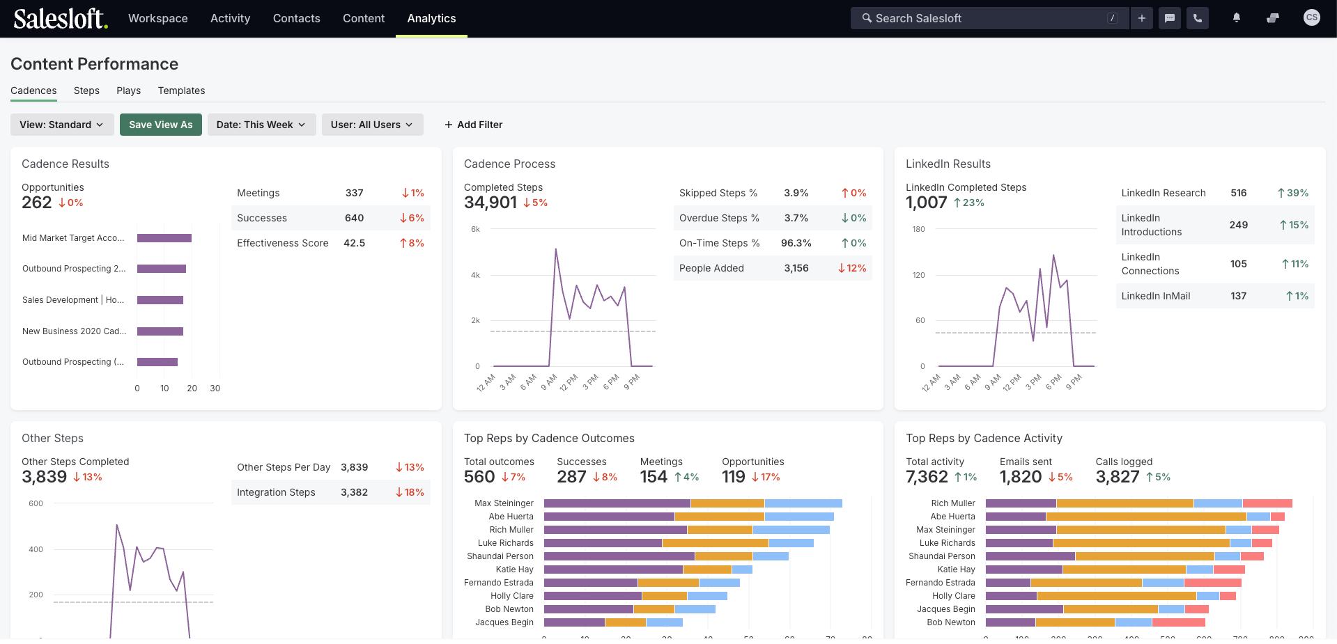
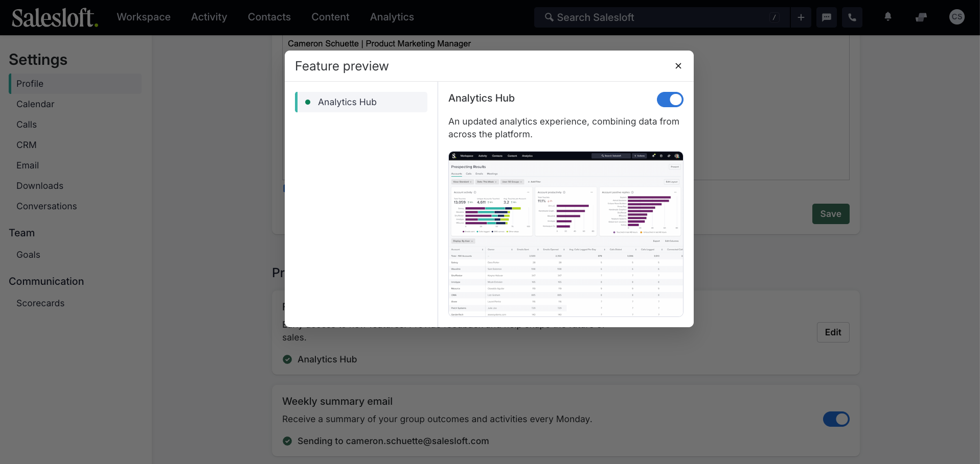
That’s why we’re excited to introduce Analytics Hub as part of our June product release to give you a comprehensive view of revenue performance that helps you understand the full sales lifecycle and pinpoint areas to improve. Available now as a feature preview, Analytics Hub consolidates all Salesloft reports into a single pane of glass so that you can get the information you need without navigating to different parts of the platform.
Unifying data across the full customer lifecycle
Salesloft understands the challenges sales teams face when it comes to data analytics. The Analytics Hub is not just another tool; it's a comprehensive solution that brings together data from across the full platform, from Cadence and Rhythm to Conversations and Deals. It provides a single, easy-to-navigate focal point for understanding how actions impact outcomes throughout the entire customer lifecycle.
Analytics Hub makes it easy for Rev Ops to regularly share reports, monitor KPIs, and identify bottlenecks creating inefficiencies in the sales process. Sales managers and leaders can quickly understand the big-picture trends impacting their sales strategy and team performance and then drill down to make adjustments at the tactical level.
Reports are organized by job function to streamline workflows:
- Prospecting Results: Understand what’s happening at the top of the funnel like accounts reached, most active Cadences, and call, email, and meeting activity.
- Pipeline Review (for Deals): Understand what’s happening in the pipeline once an opportunity has been created like deal stage progression, conversion rates, and overall sales growth.
- Team Productivity: Understand how specific sellers or teams are performing across the sales cycle including outcomes, activities, conversation trends, and process adherence.
- Content Performance: Understand how Cadences, Plays, and email templates are performing.
Plus, you’ll notice a few enhancements to the reporting experience:
- Charts to visualize a high-level overview of each report
- Date and user filters stick across all reports during your session so you don’t have to reset on every page
- Display By setting to switch between views without searching for a new report
Analytics Hub is turned on by default. To revert to the legacy analytics experience during the feature preview period:
- Navigate to Settings in Salesloft
- On your Profile, scroll down to Feature Preview
- Click edit to toggle the Analytics Hub preview on/off
Capture buyer activity throughout the purchase cycle
In our Summer Launch, we introduced more AI-powered, signal-based selling capabilities that help sellers capture and act on any buying signal, throughout the customer journey. We know that buyers start researching your product long before a seller is ever involved, but they often feel like they are starting over when the salesperson gets involved.
With new Drift Plays, you can not only respond in real-time to high intent website visitors, but also tailor your initial email with AI-recommended content based on how that buyer interacted with your digital brand. And Custom Plays allow you to connect any third-party system to Salesloft via API, so you can enable your sales team to react to buying signals like product usage, custom lead scoring, or any other critical milestone.